Critiques On Other Works

Post and discuss creative ideas

Critiques On Other Works

Postby Off Topic » Tue Oct 21, 2014 5:42 pm

Hi pals! I can haz another topic for my workz plz?
I've realized the other one got themed to one work only ( my fault I guess), but I'd like to hear your opinions and critiques also on other stuff I do!

So... right now a secondary project which I'm looking forward to animate with flash ( should be faster) is in need of a main character.
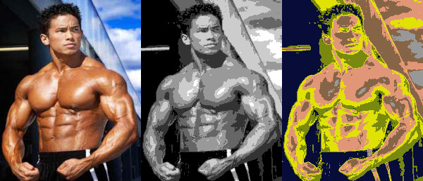
I thought about this one.
Some background?
Ok... I don't know its sex because I'm still evaluating the opportunity to make it male ( sex games with males are fewer and offer the possibility to give them a different feeling/gameplay), but this aside I'm planning to make it a game with nvidia's physiX engine ( built in Unity): you'll use that rope to reach your goals... and platforms, because I'm pretty sure It'll be a porn platform.
Building a rope using physic is a pain in the ass but I've already built one so it's safe to say that feature will be featured ( I''ve been improving at programming stuff lately :D ).

The story will be weird and will have a lot to do with BDSM... as a matter of fact the whole project is called Bondage-Mouse so masters and slaves will be our bread and butter.
Ever heard of Michael Manning? Well, I do, since I was a teenager ( now I'm a young immature adult)!
You can find some of his stuff here and probably read them putting their titles in a decent hentai-site search bar ( i use e-hentai lately).
If you're too lazy to read them I can tell you my summary: there are masters fighting for power and slaves that act as sex-soldiers, and slaves of slaves that act as bitches ( simply put).
The idea is to misinterpret his visionary vision and build a setting somewhere between that and gotham/sin city ( a hellish intent? maybe... :twisted: )

So, that mouse is part of a caste of super bondage soldiers with a picky name ( say, messores nocti plural / messor nocti singular, which is " night reapers", I don't really care now and I'm open to suggestions!) that serve the Tyrant of a pulp and gloomy city like the ones mentioned above.
TvTropes here: one day some of this elite dudes ( the Starscream) decide to rule the city by himself and goes face-heel turn inciting a riot that puts a lot of dangerous slaves in the position to take vengeance on their previous masters.
And just when things are almost fubar out of the shadows comes our hero/heroine to save the day.

You'll play using your rope to tie the slaves and as a grappling hook like bionic commando.
Instead of a complicated animation to tie them up we have that lock on the top of the rope that closes on target making a " wham!" in 1966 batman style and magically fasten the target.
Physic is used mainly to puzzle the player and to set up " traps".

Enough talking I guess, here's the character so far!
Let me know what you think and if you're interested in collaboration ( and if s/he's missing something)... thanks for your time! :mrgreen:
Attachments
BondageMouseTestLight.jpg
With Fancy Lights
BondageMouseTestFlat.jpg
Flat Colours
eticapatetica ~ now with +37% of gayness!
User avatar
Off Topic
 
Joined: Sun Oct 14, 2012 9:44 pm

Re: Critiques On Other Works

Postby Off Topic » Thu Dec 04, 2014 1:36 am

Well, it seems my primary project is demanding more time than I originally thought when I opened this new topic!
Some time in the future I'll be able to show other stuff I'm currently working on ( in the spare time)... like, 3d stuff that will hopefully turn out decently!

In the meantime, I'd like to post a pic I made for my current project.
Since it's not animated, I'll post it here to not disrupt the focus on animation we've achieved in the other thread.

If you got something to say, positive or not, please, let me know :D
Attachments
PinUpResized.jpg
eticapatetica ~ now with +37% of gayness!
User avatar
Off Topic
 
Joined: Sun Oct 14, 2012 9:44 pm

Re: Critiques On Other Works

Postby that man » Thu Dec 04, 2014 7:47 pm

Off Topic Wrote:Well, it seems my primary project is demanding more time than I originally thought when I opened this new topic!
Some time in the future I'll be able to show other stuff I'm currently working on ( in the spare time)... like, 3d stuff that will hopefully turn out decently!

In the meantime, I'd like to post a pic I made for my current project.
Since it's not animated, I'll post it here to not disrupt the focus on animation we've achieved in the other thread.

If you got something to say, positive or not, please, let me know :D

...
Spoiler (click to show/hide):

that face scares me. Please change it.
that man
 
Joined: Sat Jul 28, 2012 5:07 pm

Re: Critiques On Other Works

Postby Off Topic » Fri Dec 05, 2014 11:52 am

Interesting enough! I think I know what's not to like with it, I'll be more careful in the future, thank's for pointing that out! :D

I suppose it's about a combination of shapes that I usually draw just out of habit; when you try to convert a face like that to say, 3d, those shapes fucks up even more!
It'll take some time for me to find a good compromise, but it'll be added to the " to do list"!
eticapatetica ~ now with +37% of gayness!
User avatar
Off Topic
 
Joined: Sun Oct 14, 2012 9:44 pm

Re: Critiques On Other Works

Postby Off Topic » Tue Jan 12, 2016 10:24 pm

Hey there! I'm kinda necro-posting my own stuff and I apologise but I had no other place to put this since one of my threads is about animations and the other is about a game... I created this one for posting basic drawings and ideas I guess and even if I left it for a long while, I'm now in need of it once again!

I wanted to share this drawing here... it's gonna be 1 illustration of a comic strip about the next update of the game, but right now it's just a work in progress image.

Since the last time 1 user was so kind to drop me a few lines of critiques, and he/she did me a great favour, I'd like to know what's good with this thing so far and what's not.

Because programming for almost 1 full year kept me away from my pencil and thus I believe I have to work out to get some rust off ( dunno if this is the proper idiom :D )... plus I want to improve!

Now, I never liked the way I coloured stuff, I tried something new with this one... something that could make me feel comfortable in dropping pencil's lines and go full digital.
I've started with the leftmost mutant, and moved to the right; then I did the Cespora or bush-sheep, then the player.
Since I was experimenting, the first mutant I coloured is also the one I like the less because it feels sloppy... I know I should re-colour it and who knows, maybe I will :lol:, but the rest seems decent to me, I mean, the biggest flaws I can see is lack of ambient occlusion and fake lights.
Fake, yes, but still decent enough I believe, plus I might wrap my head around the matter of ambient and lights a bit more once I'm through all the colours, so a bit of rework to blend together all the characters is already scheduled :mrgreen:
Attachments
workinprogressZoomed.jpg
workinprogress.jpg
eticapatetica ~ now with +37% of gayness!
User avatar
Off Topic
 
Joined: Sun Oct 14, 2012 9:44 pm

Re: Critiques On Other Works

Postby AcetheSuperVillain » Wed Jan 13, 2016 5:24 am

You could try pushing value a bit more. Make each color zone go from pure black to pure white. Boris Vallejo does some good examples of this, although his value ranges may be more intense than you want for a comedic mood.

If you want to abandon lines, you still have a very liney look to the muscles on the mutants and it does look a little out of place compared to the rest of the colors. Instead of looking at features like muscles as edges, try thinking of them as shapes. A helpful exercise for learning to think this way is to grab some reference images and use a posterize filter on them. Here is an example:
Image
First is the original. Second is desaturated and posterized. Third is high contrast so that you can see the shading zones instead of the image. So rather than make the muscle with lines, make the muscle with blobs of color. This is difficult to explain...

However, that is only if you want to make less lines. Personally, I love lines, but choose what you like.
User avatar
AcetheSuperVillain
 
Joined: Tue Feb 03, 2015 9:27 pm
Location: Space

Re: Critiques On Other Works

Postby Off Topic » Wed Jan 13, 2016 2:44 pm

Hey there!

Awesome! That's something I wasn't thinking about, and it's definitely worth attention!
I haven't fully understood what should be done but I did get the general idea, I've many images of Vallejo and will use them along with some tutorial to see if something starts ticking in regards of colour-shapes.

Thanks for sharing :D
eticapatetica ~ now with +37% of gayness!
User avatar
Off Topic
 
Joined: Sun Oct 14, 2012 9:44 pm

Re: Critiques On Other Works

Postby Jumbo70 » Wed Jan 27, 2016 8:06 pm

AcetheSuperVillain Wrote:You could try pushing value a bit more. Make each color zone go from pure black to pure white. Boris Vallejo does some good examples of this, although his value ranges may be more intense than you want for a comedic mood.

If you want to abandon lines, you still have a very liney look to the muscles on the mutants and it does look a little out of place compared to the rest of the colors. Instead of looking at features like muscles as edges, try thinking of them as shapes. A helpful exercise for learning to think this way is to grab some reference images and use a posterize filter on them. Here is an example: This is difficult to explain...

Now this is something i havent tought about, thanks a ton!
User avatar
Jumbo70
 
Joined: Tue Nov 01, 2011 3:14 pm
Location: In your Finnish wardrobe

Re: Critiques On Other Works

Postby Off Topic » Fri Feb 05, 2016 7:21 pm

I've tried different techniques to color the animations in the past days, I can't decide which would fit best, what's your opinion about it?

I can either go through clean up and colouring at the speed of 1 frame per ~30 minutes ( often less), or I can skip clean up discard pencil lines and use photoshop' stroke effects to mimic black edges, improving quality but consuming 1 hour and 15 minutes per frame.

Currently I can't make the second option any faster though I'm trying to find a way to achieve a more reasonable pace ( no matter how hard I try this shit always takes time :mrgreen: )

Here is an image with both the techniques applied, you can guess by the quality of the edges that left is 1 hour and 15 minutes and right is 30 minutes.
You can see both a scaled version that will be used in the game and the one in which I work on them ( to be correct though, the size of the " high quality" image is 3 times the one displayed...), and I've included one old frame currently used in the game at its regular size to help comparing.

I don't want to feed you with shitty images, my drawings are already bad enough so there's no need to add low quality upon that... but I'd like to take quickly care of these animations so I can produce more of them! I'm confused :o

Can you notice the low quality? Is it that bad?
Attachments
QualityComparison.jpg
eticapatetica ~ now with +37% of gayness!
User avatar
Off Topic
 
Joined: Sun Oct 14, 2012 9:44 pm

Re: Critiques On Other Works

Postby Digitally-Deviant » Sat Feb 06, 2016 1:28 am

It's really noticeable on her arms and legs, in the larger scale version. In the smaller game versions it's not as bad, I doubt it will be noticeable when the animations is playing. You could do it the quick way, and fix the images later if it really bothers you.

It's coming along nicely. I like how your handling the sex animation. It currently looks like she is slamming down, and popping his dick like a balloon in the clip you've made. I thought, wow that's a tight pussy, when I saw it. "P
User avatar
Digitally-Deviant
 
Joined: Mon Dec 15, 2014 3:53 am

Re: Critiques On Other Works

Postby Off Topic » Sun Feb 07, 2016 1:30 pm

Hey mate! Thanks for your timely reply!

Haha yeah, by the time I was done with the animation I realised her pussy was made of iron :lol: It's like a super power: she never slackens!

It turned out that way but I don't mind at all :mrgreen:
eticapatetica ~ now with +37% of gayness!
User avatar
Off Topic
 
Joined: Sun Oct 14, 2012 9:44 pm

Re: Critiques On Other Works

Postby Off Topic » Mon Mar 07, 2016 1:40 am

Sooo.... during the past months I took some time to practice drawings and posted on DA using an unrelated account.

That's because I drew femboys... because I'm a bi-pervert y'know?

My skills still suck but maybe I've managed to improve a bit.
Just so you know I wasn't lazing about I'll post the ugly ones and the decent ones together... but due to homo content I'll kindly use spoilers.

I'm currently working on a fifth... then I'll get back to colour animations I promise! ( that's sooo fucking boring... :lol: )

Spoiler (click to show/hide):

Spurts1almostDone.jpg


Spoiler (click to show/hide):

spurts2.jpg


Spoiler (click to show/hide):

Spurts3.jpg


Spoiler (click to show/hide):

Spurts4.jpg
eticapatetica ~ now with +37% of gayness!
User avatar
Off Topic
 
Joined: Sun Oct 14, 2012 9:44 pm

Re: Critiques On Other Works

Postby Digitally-Deviant » Mon Mar 07, 2016 6:31 pm

That blue monster is awesome looking! :lol:
User avatar
Digitally-Deviant
 
Joined: Mon Dec 15, 2014 3:53 am


Return to Discussion


Who is online

Users browsing this forum: Bing [Bot]